
There are many things that come with a ‘Black Label’ version which normally denotes a difference between itself and the original. For instance, it is very common to find whiskies/whiskys where the range includes a ‘Black Label’ variety; Johnnie Walker and Jameson both leap to mind; although if you are planning on trying the former then Blue Label is the only way to go.
However, this is the first ink I have come across that specifically has a Black Label version of itself. This ink came into being as a direct result of its maker, Dr Peter Kovar, listening to and acting on customer feedback asking him for an ink exactly like the original but with little or no sheen.
If you are not familiar with the original No.1 ink; it is a wonderfully rich blue with a very nice red sheen, which I reviewed a few weeks ago.
This meant Peter had to attempt the impossible and produce an ink that was as near as possible the same as the original minus the sheen. Well it turns out that the impossible is possible and this is what Peter has done, and the results are impressive.
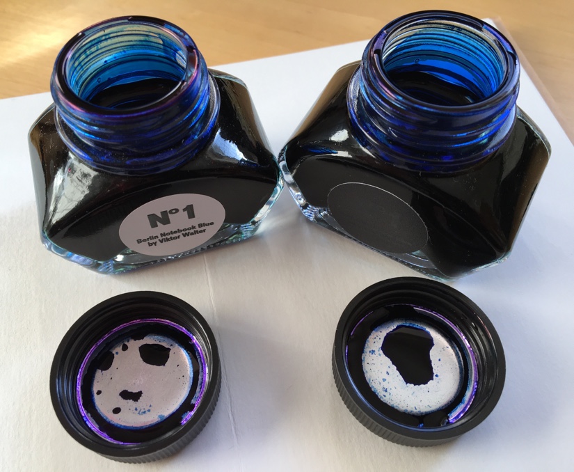
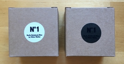
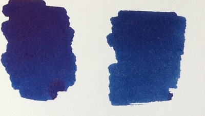
Black Label comes in the same 30ml bottle and cardboard box as the original and other than literally having a black label they are identical, until you open them. As you can see just from looking at the image at the top of this review the sheen is obvious on the original No.1 whereas the Black Label version has a lot less sheen. It is even more obvious on the image below where the top stripe is original No.1 and the bottom one is Black Label. Black Label still has some sheen, but it is only a little around the edges whilst the original ink has sheen throughout.

When you look at the Q-Tip test you can see the difference in the two versions; the original, on the left, looks a slightly richer colour whilst the Black Label looks a little flatter as a colour but at the same time a more definite blue.
The text samples are very similar which ultimately is what matters because that is what people base their judgements upon and it means that Peter achieved his goal of creating an ink that is almost sheen free and a very close colour match to the original.

I started this post by pitting the two inks against each other and I have to say I don’t think one is better than the other they are just different; so this is one of those times when I am happy to recommend either original or Black Label No.1 to you. It really just depends on your preference where sheen is concerned and if you intend to use it at work whether there are any professional restrictions on the ink colours you can use.
What I do recommend is that you take a trip to Peter’s site and treat yourself to some ink and maybe a notebook or two.
Disclaimer: The ink was purchased with my own funds at retail price. The opinions expressed in this review are my own; and I am not connected with either the retailers or manufacturers in any way.

I am really enjoying my bottle of Black Label. I’ve just ordered the new pink/red, too. And I had a super experience ordering from Berlin — a stand-up company. Exactly what this hobby should be about.
LikeLike
Hi Anthony
Thank you for reading the review.
I really like the original No.1 ink but the Black Label is growing on me; I have also ordered my bottle of No.5 and I’m hoping it arrives this week. I’m keen to see what a pink/red looks like and I agree with you, the service from Peter is superb.
Best wishes
Charlie
LikeLiked by 1 person
I’m intrigued! Do you know where I can get a bottle in north america, or is it only available on their website?
LikeLike
Hi Anne
I think they only sell through their site and as far as I can tell it’s €1.50 to ship ink pretty much anywhere.
Best wishes
Charlie
LikeLiked by 1 person